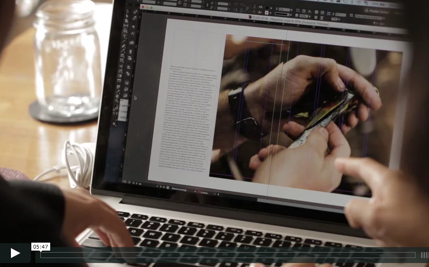
The Making of FLUX Hawaii's Redesign from FLUX Hawaii on Vimeo.
“My goal for every redesign is to enhance readability. I’m also inspired by how our reading style is evolving because of social media and how we access information online.” – Creative Director Ara Feducia
Everybody loves a good makeover. So do those of us at FLUX Hawaii. As its name suggests, our magazine regularly evolves to meet reading habits and styles in today’s ever-increasingly digital landscape. Such shifts helped steer the redesign (which is the magazine’s fourth) in subtle ways, including the addition of more pull quotes, fonts with greater readability, and a four-column grid. Flipping through the newest issue, perhaps the most striking change is the switch from matte coated to uncoated paper (now utilized for the entire family of publications of Nella Media Group, FLUX’s parent company), which enhances the humanism of those featured in each issue. But there is much more to the new issue than just this. Below, creative director Ara Feducia explains some of the changes introduced with the redesign.
NEW READING FONT: Athelas

Since issue one, FLUX’s reading type was the old-style serif Adobe Garamond, but Feducia sought to enhance readability with the use of a new serif, Athelas. “Our original typeface had too much contrast in stroke weight, too many differences from thick to thin,” Feducia says. “I believe that’s the influence of the internet and possibly my nearsightedness.” Of Athelas, Feducia says, “This beautiful typeface has an extremely large x-height. The higher the x-height, the higher the readability.” Another great example of a readable typeface with a high x-height? That of highway signs. “When you drive by, there’s usually no problem reading the information because it was designed with an extremely high x-height,” Feducia says.
NEW TITLE FONT: Baskerville

“It’s funny because I really feel like choosing the title typeface is like choosing a winner for a beauty pageant,” Feducia says. Out of the finalists she had selected, she settled on Baskerville because it had the most beautiful letter “Q.”
ADDITIONAL PULL QUOTES IN THE RIGHT COLUMN
Instead of leaving reading text to stand alone, Feducia has added intermittent pull quotes in the open right column, where circular images and captions also sit. This decision was influenced by more typical consumption of media online, in which readers quickly scroll through stories for the highlights. “I want to satisfy the type of reader who likes to flip through magazines and only enjoy the beautiful photography that we have,” Feducia says.
MORE CONSISTENT 4-COLUMN GRID
“I wanted to create an illusion of more negative space, but keep a three-column reading flow, especially in the features section,” Feducia says. “Adding space in print is no different than adding long panels to curtains on your windows to create the illusion of height. Skinnier columns create an illusion of height, creating an illusion of elegance.”
ARRESTING RED HIGHLIGHTS

“The use of red really comes from that design saying from Anne Bush,” Feducia says. “ʻIf you can’t make it good, make it big. If you can’t make it big, make it red.’” As stop signs do, the color halts the reader and calls attention to a particular detail.
CIRCULAR IMAGES

Now, readers can find small images cropped circularly throughout the magazine. These images contribute extra visual detail to a story—a close-up of a dish, the face of the owner of a company—without taking up much space. “Obviously, circle images look charming,” Feducia says. “But my inspiration comes from cinema, and the idea of zooming in for a close-up shot of the main actor to add a deeper connection to the story.”
UNCOATED PAPER
FLUX has been printed on matte coated paper since its first issue, but Nella Media Group began featuring uncoated paper in several of its publications, which Feducia also designs, a couple years ago. The uncoated stock adds an airiness to the magazine, while also adding a sense of warmth, since the inks absorb so richly into the paper. “There is something humanistic and more tangible about uncoated paper,” Feducia says. “The texture and feel seem more connected with what I imagine our readers would appreciate.”
This redesign debuted with the Migration issue. Get it here.