
Anyone who has ridden the bus knows it is a deceptively easy task, even with that godsend DaBus app. Stops on opposite sides of the streets, numbers, times, transfers–everything has to be juggled in our heads. But less often (typically, only when something confounds us) do riders think about what goes into creating the schedules and routes and communicating it to the masses.
As a project for professor Chae Ho Lee’s ART 366 course at University of Hawai’i at Mānoa, students were asked to do a small part of this: Redesign one of the bus system’s almost 100 route map posters. The goal of the project was to understand the role designers play in helping individuals navigate information. Below, meet four of the students who rocked this year’s course.


TRAVIN NAGASAWA, UH senior
I commute by car, but when I was in middle and high school, I caught the Route 4 bus occasionally. The main thing that I changed for the bus schedule was the time-table format. I wanted it to be more organized by using a grid format and I wanted it to be more visual, primarily by color, to effectively portray the large amount of information to the reader.
My favorite detail in this project is the color tones. It really helped organize the hierarchy of the information. Through the project, I learned how to create visual systems to effectively display and organize content in a minimal size. With a complex system like transit, organization and efficiency is key, and their schedules need to portray the same.


COURTNEY HARA, UH senior
I have been using the bus system since high school. The main route I currently take is Route 6, which is the schedule that I chose to redesign. Having used the time tables on TheBus schedules, I wanted to create something that would be easier to use and understand; not just provide the necessary information.
The main change I made is that the information is spaced out into something like a line graph instead of being packed into tables. Using the bus schedule, I always found myself getting lost in the numbers. Trying to follow a route through all of its major stops got confusing and was a little hard on the eyes. My favorite details are the semi-circle tabs. They add a little dimension to the more common accordion fold of the form.


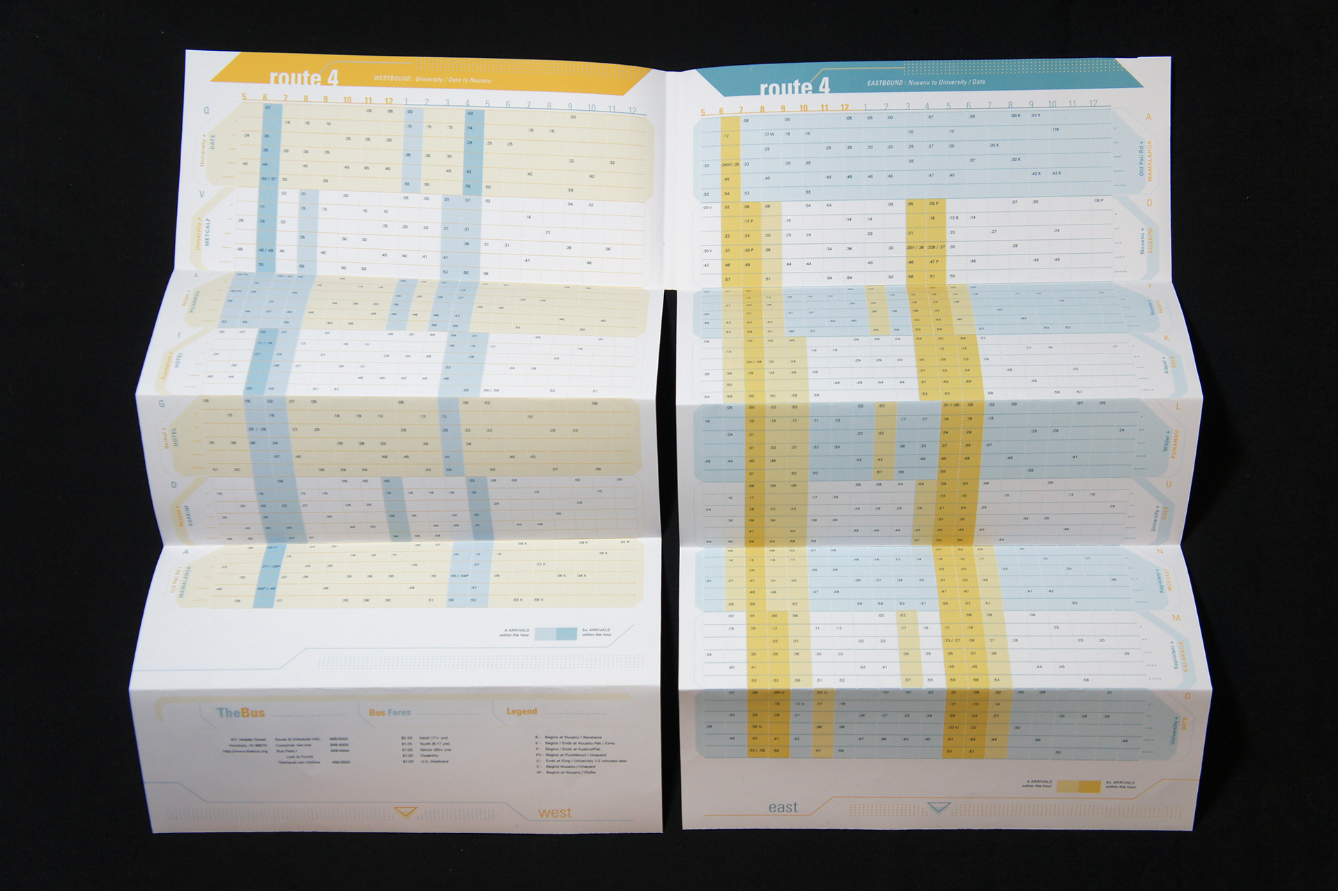
TREVOR MANU, 2014 UH graduate
During my time at UH I did ride the bus, and in fact based my design on the route I took (Route 4). The experience of riding the bus, and most noticeably the wildly fluctuating arrival and departure times during morning rush hour, led me to find ways to quickly and easily discern specific arrivals from the substantial amount of data found on a single page.
Perhaps my most obvious change was separating the morning versus afternoon and evening schedules on to their own viewing planes. This gives you four quickly accessible schedules within the booklet (AM/PM of Eastbound/Westbound buses). Reinforcing the need for a quick discernment of time, this change remedies the problem I would have of reading too far ahead, and the extra space allows the times and stops to have more comfortable reading and reference margins.
My biggest takeaway from this project was just how much impact subtlety and space affect readability and ease of use. Coming into graphic design, I was very heavy-handed with my solutions, but this project in particular, with its swathes of data requiring a very deliberate and nuanced touch, helped me develop a more sensible eye.


MITCHELL FONG, UH senior
I ride the bus quite often and have observed things I find valuable as a rider. I chose the route I am most familiar with–the one I used to ride home from high school. For the project, I split the Eastbound and Westbound routes, and arranged the arrival times in a way that would make easier to understand how often a bus would pass a stop. This way if a person missed the bus, they would be able to see when the next bus would be arriving.
The challenge with this assignment was to take all of the data points on schedule and visualize them in a way that was easier to navigate. I am particularly proud of the way the folds of the pamphlet are divided into five hour segments. It breaks up the route into the hours that are most relevant to the user. And because only a portion needs to be revealed, it becomes easier to hold.
Ease of use should be the most important when redesigning TheBus schedule. Anyone can make data look pretty, but to make it intuitive to use is a more difficult task. And in the age of smartphones, it becomes harder from printed material to compete. However, to many who ride the bus, the low cost and reliability of the printed schedule is invaluable.