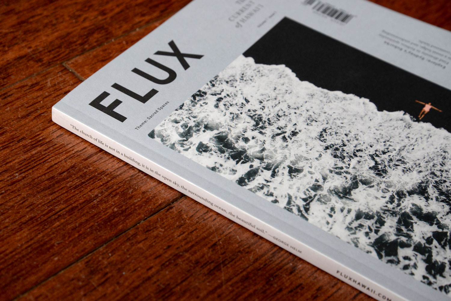
The Sacred Spaces issue is the start of a refined look for FLUX. The magazine has a new ratio, barcode, and cover design. There are also two new sections, “living well” and “explore,” part of the move to increase the length of the issue. The inner pages are printed on thinner uncoated paper. Even the spine of the magazine got a makeover, now featuring a quote from each issue. With all the changes, we asked our team of creators to share their favorite parts of this current FLUX aesthetic.

Publisher Jason Cutinella:
“My favorite part is the new size, from the page count to the type of paper we are using (also love that our design is always evolving). Why? I feel it gives FLUX a look and feel like no other publication in Hawaii and it now compares to certain international publications.”
Managing editor Anna Harmon:
“I love it all. The new ratio—the magazine is the same height, but slightly narrower—flatters our photography, while the increased paged count allows the stories to breathe more, and gave us the chance to add new sections that I am really excited about. Between the added page count and thinner paper, it now makes me think fondly of paperback novels you carry with you everywhere because you can’t put them down.”
Creative director Ara Feducia:
“The new FLUX redesign is an affirmation of our team’s creative determination and timeliness. Truly, I am honored to be working with such a productive team.”
Designer Michelle Ganeku:
“My favorite part of the redesign is that since we are now tri-annual, the magazine became thicker but still manages to keep the same rich content. It feels like more of a keepsake.”

Designer Mitchell Fong:
“I like the changes made to the cover. The photography is still the center of attention while incorporating more information about the content of the issue. This makes it look like a journal of current Hawai‘i living.”
Editor Lisa Yamada:
“I love the weight of having a 192-page book, but also the airiness that results from having a lighter paper stock (from 80 lbs. to 50 lbs.). I even love the ‘ghosting’ of images that appears like a soft whisper of the pages you left behind and the pages yet to come. I love the added image spreads that separate each section of the magazine and how they allow the reader respite before jumping into a new section. I love that we are highlighting quotes from our stories, on our spine and on the aforementioned intro spreads–our subjects are the true storytellers, after all. I love everything about this refined look of FLUX. After being established as a quarterly since the magazine’s launch in 2010, it can be hard to accept change—especially transforming into a triannual publication. But I love that we continue to evolve into a lifestyle brand and move into creative new avenues for media. Storytelling does not just come in the form of a print publication, but can be told through apparel, social and digital media—which you will see us developing more in the future. Stay tuned…”