
You’ve seen them, those subtle signs that define our islands. So has graphic artist Matthew Tapia.
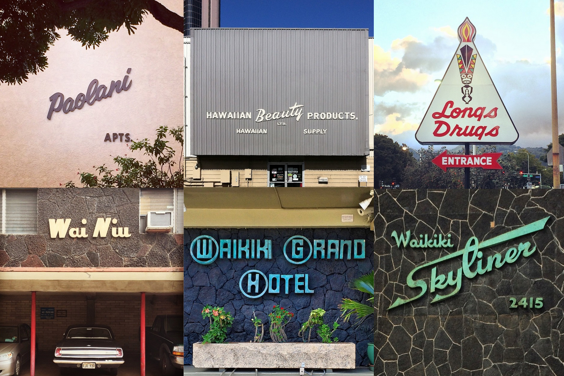
Matthew Tapia, a Hawai‘i-based letterer and graphic artist, is not immortal—though his “Signs of Hawaii” series on Instagram might imply otherwise. With images of iconic building names like that of the Hawaii Theater, Queen Kapiolani, Like Like Drive Inn, and snaps of decades-old signage stating things like “Please do not pick the papaya,” Tapia’s profile has found a following around the nation.
“Type has a history to it, different fonts and styles existed in different eras,” he says. “It’s very indicative to the place and time, evoking nostalgia in a very direct way. You can see the history of any city just by looking at the script setting.”
Type has a history to it, different fonts and styles existed in different eras. It’s very indicative to the place and time, evoking nostalgia in a very direct way.
Rather than seeking a new or contrived identity, Tapia looks to the old, the lost and the forgotten. Drawn particularly to the ’40s and ’50s era of type design, Tapia documents this with his series filed under #signsofhawaii. His followers (all 42,000 of them) delight in revisiting old sites once frequented, getting a glimpse into Hawai‘i’s graphic beginnings.
“Looking back, you can see the beginnings of commercialization in Hawai‘i,” he says. “Back then, it was a big deal to have a big script space. At first, it painted a picture of what advertisers wanted us to be: This whimsical idea of an island paradise. Over time, it has solidified itself as part of our history.”
Working with what his environment provides, the 34-year-old artist focuses primarily on illustration and lettering, creating logos, sketches, typefaces, and even three-dimensional letters in the sand.

Together, they convey an identity—one that reflects his childhood, adolescent years, and adulthood. Tapia was born and raised in Honolulu, but split time between his parents, who lived on opposite sides of town. Switching from school to school, he ended up in foster care.
“Maybe they couldn’t parent me right, maybe I was too rebellious,” he says. “Either way, that childhood didn’t gear me up to be successful. Later on in life, I found those that steered me in the right direction and were positive influences on my career.”
Among his favorite signs are the Sheraton, the Waikiki Skyliner and the Waikiki Grand hotels, which he says convey traditional Hawai‘i, as well as the commercial typeface of the time.
“They were made when the visuals of lettering and tourism were prominent,” he says. “The rendering of it, the way the copper has oxidized over time is really beautiful. The more you look at it, the more you get out of it.”
Share your #signsofhawaii with us at @fluxhawaii on Instagram.